---
title: "Exploring Data"
subtitle: "Week 2"
date: 2025-04-10
format:
html:
embed-resources: true
toc: true
---
# Before we start
- No Thursday discussion section next week
- But! Script will be published on the website. Go through it! Data classes will be discussed there!
- Questions regarding Lab Assignment or the class?
# Quick Recap
## Substantive
- What is a **Causal Relation**?
- What is **Confounder**?
- Independent Variable vs Dependent Variable?
- Control Variable?
## Coding
- What is a Chunk?
- What is a CSV file? How is it different from Excel file?
# Agenda
- Continuing to adapt to R and RStudio
- Exploring Data
- Tracking Missingness
# Markdown and Quarto
This whole website was built using R, Markdown and Quarto. Let's quickly overview these languages
In RStudio, you can use Markdown language to format text.
For example, **this is bold text** and *this is italic text*. And, of course, you can insert images. It's pretty easy, and after the class you can take a look at some [tutorials](https://www.markdownguide.org/basic-syntax/).

You can do many-many more different things. In this regard, visual editor in RStudio might be helpful. Markdown is also used in several note taking apps, e.g. [Obsidian](https://obsidian.md) or [Notion](https://www.notion.so). Feel free to utilize your Markdown knowledge for your studies.
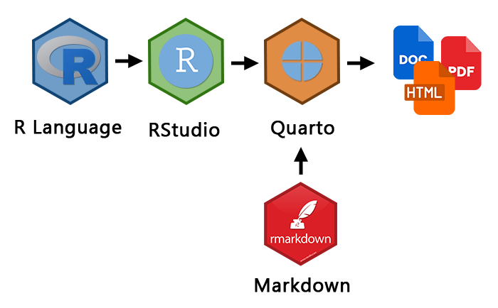
Generally, what we've done so far can be described by the image below. We have used R ("engine") and RStudio ("car"). In Rstudio we have Quarto, which is this document you are working with right now. We can do a lot of things right away -- e.g., render our output to a Word document, PDF or HTML.
# Finding Data
Let’s explore Comparative Political Dataset. It consists of political and institutional country-level data. Take a look on their [codebook](https://cpds-data.org/wp-content/uploads/2024/11/codebook_cpds.pdf).
Today we are working with the following variables.
- `year` - year variable
- `country` - country variable
- `prefisc_gini` - Gini index. What is it?
- `eu` - member states of the European Union identification
- `openc` - Openness of the economy (trade as % of GDP)
- `poco` - post-communist countries post-communist countries identification
If you don't have `readxl` library installed, do it using `install.packages()`. Run it only once!
```{r}
library(readxl)
cpds = read_excel("data/cpds.xlsx")
```
Load the `tidyverse` library
```{r}
#| message: false
library(tidyverse)
```
# Exploring data
First of all, let's subset the variables we have outlined for the ease of working with data.
```{r}
cpds_subset = cpds %>%
select(year, country, prefisc_gini, eu, openc, poco)
```
How does the data look like? Using `head()` let's present first rows to get the sense. What is NA?
```{r}
head(cpds_subset)
```
Explore the distribution of Gini below. What can we observe? Pay attention to `aes()` argument.
```{r}
ggplot(cpds_subset) +
geom_histogram(aes(x = prefisc_gini))
```
What is an average Gini coefficient? Pay attention to the `na.rm = TRUE` argument.
```{r}
mean(cpds_subset$prefisc_gini, na.rm = TRUE)
```
Let's include this information on the plot, customizing it in the meantime. Pay attention to `theme_bw()` and `labs()` functions. You can explore ggplot themes [here](https://ggplot2.tidyverse.org/reference/ggtheme.html).
```{r}
ggplot(cpds_subset) +
geom_histogram(aes(x = prefisc_gini)) +
geom_vline(xintercept = mean(cpds_subset$prefisc_gini, na.rm = TRUE), color = "red") +
theme_bw() +
labs(x = "Gini Coefficient",
y = "Count",
title = "Distribution of Gini Coefficient")
```
Let's explore the distribution by groups. For example, EU countries to non-EU countries. Use `eu` variable for this and `geom_boxplot()`. But wow! We didn't get the group comparison, any ideas why?
```{r}
ggplot(cpds_subset) +
geom_boxplot(aes(y = prefisc_gini, x = eu))
```
Let's correct the class of variables. We'll discuss the classes more in a detail next week*. Fantastic! Are these groups different? Add `drop_na(eu)` to remove the NA category on the graph.
```{r}
cpds_subset %>%
mutate(eu = as.factor(eu)) %>%
ggplot() +
geom_boxplot(aes(y = prefisc_gini, x = eu))
```
::: {.callout-tip icon="false"}
## Coding Task
Imagine, you were asked the following question. Does a communist past lead to a more open economy?
Let's explore these variables:
- `openc` - Openness of the economy (trade as % of GDP)
- `poco` - post-communist countries post-communist countries identification
They are already in `cpds_subset`. Draw a distribution of `openc` variable using `geom_histogram()`.
```{r}
#| eval: false
ggplot(...) +
...(aes(x = openc))
```
Add an average of `openc` to the plot using `geom_vline()`
```{r}
#| eval: false
ggplot(cpds_subset) +
geom_histogram(...(x = ...)) +
...(xintercept = mean(cpds_subset$openc))
```
Compare post-communist countries to non post-communist countries (`poco`) in terms of the openness of the economy (`openc`). Use `geom_boxplot()`, and don't forget to make sure the class of the variable is the right one!
```{r}
```
Insert a chunk, add labels and cutsomize the plot.
...
Did we address the question posed at the beginning? Did we approach it descriptively, predictively, or causally? Take a moment to think through that and write down your thoughts.
:::
# Exploring missing values
Quite often there are missing values in the data. Let's, first of all, understand how big of the problem is. Why are there this many missing values?
```{r}
is.na(cpds_subset$prefisc_gini) %>%
sum()
```
Let's create a variable indicating if the values are missing or not.
```{r}
cpds_subset = cpds_subset %>%
mutate(gini_na = is.na(prefisc_gini))
```
Now, check the dynamics in years. Let's wrangle the data to count the number of missing/non-missing values per year.
```{r}
missing_years = cpds_subset %>%
group_by(year, gini_na) %>%
count()
missing_years %>%
head()
```
Finally, let's plot it using `geom_col()` - which is quite similar to `geom_histogram()`. Take a moment to compare it. Which years have more missing values, and which have fewer?
```{r}
missing_years %>%
ggplot() +
geom_col(aes(x = year, y = n, fill = gini_na), position = "dodge") +
labs(fill = "Missing",
x = "Year",
y = "Count")
```
Substantively, it is clear that there are some problems with the data we have to account for: the older the data, the worse is the record track of Gini Coefficient.
# Some Tips
- QoG and V-Dem were covered in the Lecture -- take some time to go through this data for your project
- Additionally, take a look on this [list of datasets](https://github.com/erikgahner/PolData)
- Sometimes we start with a question and then search for the data. However, sometimes it's the opposite: there's data available, and we ask, 'What can I use it for?'
- Merging dataframes are not as trivial, we will cover it in the future. But if you need it right now for you project, check this [tutorial](https://rpubs.com/williamsurles/293454)
# Check List
I undertsand how I can load .csv and .xlsx in R, and if I see some other unsual file extension, it will not scare me
I know how to proceed with exploratory analysis: drawing graphs is fun and useful
I know that there might be missing values, and I will keep this in mind when exploring the relationships between variables
I know what a histogram and a boxplot is. I get how we can visually compare distributions