# Agenda
- clearing environment
```{r}
iris = iris # embedded dataset
b = 2
rm(b)
```
- Wrangling data
- Joining datasets
- Visualizing relationships
- Conducting Statistical Tests
# Exploring Dataset
Today we are working with the subset of V-Dem dataset. For your reference, their codebook is available [here](https://v-dem.net/documents/38/V-Dem_Codebook_v14.pdf). Pay attention to `.RDS` file format.
```{r}
#| message: false
library(tidyverse)
vdem = readRDS("data/vdem_regimes.RDS")
```
Let's check the variables included in the data. What does `e_v2x_api` stand for? Check the codebook!
```{r}
colnames(vdem)
```
To simplify the analysis, let's rename the variable to `regime`, this would help us expedite the process of working with the data!
```{r}
vdem = vdem %>%
rename(regime = e_v2x_api_3C)
```
Now, let's change the `regime` so it's easier to comprehend. Let's discuss syntax for a second, pay special attention to `==` and `!=`!. To make the comparison more comprehendable, let's pretend there are only autocracies and democracies.
```{r}
vdem = vdem %>%
mutate(regime_categorical = case_when(regime != 1 ~ "Autocratic",
regime == 1 ~ "Democratic"))
```
Now, make sure everything is labelled correctly! Attention to `useNA = "always"`.
```{r}
table(vdem$regime_categorical, useNA = "always")
```
Now, let's draw a histogram.
```{r}
vdem %>%
ggplot() +
geom_histogram(aes(x = regime))
```
Now, let's draw the same variable, but in categorical type of data. Try adding `stat = count` to the previous histogram, too. What does it change? Don't forget to refresh previous script in mind ([link](https://artur-baranov.github.io/nu-ps312-ds/ps312-d_03.html))! Basically, we get the same information from the table.
```{r}
vdem %>%
ggplot() +
geom_histogram(aes(x = regime_categorical), stat = "count")
```
# Joining data
Imagine, we are asked: are democracies happier than non-democracies?
We can approach answering that with the skills we have! But let's develop a new one: merging datasets.
First, load the World Happiness Report data. I hope you remember the dataset! But just in case, a short reminder on variables:
- `Country_name` is the name of the country
- `Ladder_score` is the happiness score
```{r}
whr = read.csv("data/WHR.csv")
```
To merge the data, we need to choose a variable that is common to both datasets. In our case, it's the country names. Often, you would also have a year variable—but since our WHR report data is for the year 2022, let's subset the V-Dem data to include only observations from 2022. Once again, why are we using `==`?
```{r}
vdem_2022 = vdem %>%
filter(year == 2022)
```
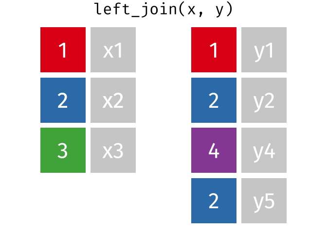
Now, let's merge the data using `left_join()`. Pay attention to the syntax, especially `by` part.
```{r}
whr_vdem = whr %>%
left_join(vdem_2022, by = c("Country_name" = "country_name"))
```
Check the result
```{r}
whr_vdem = whr_vdem %>%
select(Country_name, Ladder_score, regime, regime_categorical)
whr_vdem %>%
head()
```
This is what we did, feel free to explore the [tutorial](https://rpubs.com/williamsurles/293454).
## Analyzing missing data
Now, we likely got a missing values as a result of the merger. The problem might arise due to the different spellings or absence of observation for specific year-country in one of the datasets.
Start with `is.na()` -- it checks if there are any missing values. And now, we can easily count if there are any missing values. Everything is here! Makes sense as we used `left_join()` to attach variables to WHR data.
```{r}
is.na(whr_vdem$Ladder_score) %>%
sum()
```
However, the potential missingness might be in the "right" part of the merge, namely the V-Dem data. Let's check it, too.
```{r}
is.na(whr_vdem$regime_categorical) %>%
sum()
```
Why this might be the case? Let's explore. Using `mutate()` create an indicator variable for the missing values first. Then, using `filter()` let's leave only missing values. And finally, using `select()` let's leave only country names. What these observations have in common?
```{r}
missing_data = whr_vdem %>%
mutate(missing = is.na(regime_categorical)) %>% # create indicator variable for missing data
filter(missing == TRUE) %>% # leave only rows with missing regime type
select(Country_name) # choose the Country_name column
missing_data %>%
head()
```
Let's see how these are spelled in the V-Dem data. For example, let's take how "United States" can be spelled. Using `str_view()` we can identify if the pattern exists in `vdem_2022` dataframe.
```{r}
str_view(vdem_2022$country_name, "United States")
```
Now, let's see why there is no Kazakhstan. It is definitely missing! Probably, it was not yet ranked by V-Dem.
```{r}
vdem_2022 %>%
filter(country_name == "Kazakhstan")
```
All in all, these issues related to the most frequent reasons why data might be missing after merging:
- "Key" variables are spelled differently
- The data is not available in one of the datasets
We'll stick to removing NAs from the dataset using `na.omit()`. Check out tips in the end of the script to dig into other solutions to the problem of missing values.
```{r}
whr_vdem = whr_vdem %>%
na.omit()
```
# Visualizing Relationships
Remember, we are asked: are democracies happier than non-democracies? Given the type of data we are working with today, we'll have categories (regime types) and continuous data (happiness score).
Let's visualize distribution for `Ladder_score` in `whr_vdem` using `geom_histogram()`. Do you remember how to do this?
::: {.callout-tip icon="false"}
## Coding Task
```{r}
#| eval: false
ggplot(whr_vdem) ...
...
```
:::
Ok! A lot of things are going on. First of all, let's discuss syntax a bit. Remove `position = "identity"` to get the sense of what it stands for. Without this, it would simply draw a histogram, stacking observations on top of each other! Finally, a new argument is `alpha`. It stands for the transparency of the element (bar).
```{r}
ggplot() +
geom_histogram(data = whr_vdem, aes(x = Ladder_score, fill = regime_categorical),
position = "identity",
alpha = 0.6)
```
Now, let's calculate averages for Democracies and Autocracies.
```{r}
dem_avg = whr_vdem %>%
filter(regime_categorical == "Democratic") %>% # leave only Democratic regimes
summarize(mean = mean(Ladder_score)) # calculate the average
aut_avg = whr_vdem %>%
filter(regime_categorical == "Autocratic") %>%
summarize(mean = mean(Ladder_score))
```
And add the averages to the plot.
```{r}
ggplot() +
geom_histogram(data = whr_vdem, aes(x = Ladder_score, fill = regime_categorical),
position = "identity",
alpha = 0.6) +
geom_vline(xintercept = dem_avg$mean, color = "blue") +
geom_vline(xintercept = aut_avg$mean, color = "red")
```
Formally, we can compare it using statistical tests. For example, a Student's t-test. What does **p-value** indicate?
```{r}
t.test(whr_vdem$Ladder_score ~ whr_vdem$regime_categorical)
```
Does it mean that democracies are happier? Is it a causal relation?
# Additional Practice
Here are some exercises for you to practice what we did today. Investing some time in this would definitely pay off in the long term!
::: {.callout-tip icon="false"}
## Coding Task
In `whr_vdem` dataframe create a variable `Continent_binary` using `mutate()` and `case_when()` on `Continent` to divide observation on `North America` and `Other`.
```{r}
#| eval: false
whr_vdem = whr_vdem ...
...(Continent_binary = case_when(Continent == "North America" ... = "...",
Continent != "..." ~ "Other"))
```
Visualize the distributions. Is it helpful?
```{r}
#| eval: false
ggplot() +
geom_histogram(data = whr_vdem, aes(x = ... , ... = Continent_binary),
position = ...,
alpha = 0.6)
```
Calculate and add a a median for "Other" continents to the plot. Customize the plot, add `theme_bw()` and a title!
```{r}
#| eval: false
other_avg = whr_vdem %>%
filter(Continent == "...") ...
...(median = median(Ladder_score))
ggplot() +
...(..., aes(x = Ladder_score, fill = Continent_binary),
position = "identity",
alpha = ...) +
geom_vline(... = )
```
Perform a `t.test()` to understand if the average Happiness between North America and Other continents are statistically different. Interpret the result
:::
# Some Tips
What to do with the missing data?
- Ignore -- a preferable option for the purposes of this class
- Try out `right_join()` or `full_join()`, if applicable.
- If dealing with numeric data, you can insert an average for missing values
- Impute. A bit challenging! But something to study beyond this class
# Check List
I know how clear my environment, and I will do that occasionally
I know how to use `mutate()` and `case_when()` to recode my variables
I know how to identify missing values
I have the intuition behind merging the data, and `left_join()` helps me doing complex stuff
I know how to visualize multiple distributions
I can easily compare distributions using `t.test()` and interpret the result