library(tidyverse)Data Presentation Using Tables
Week 3
Before we start
Any questions?
For sampling hints for the next homework lab, look for Week 1 script.
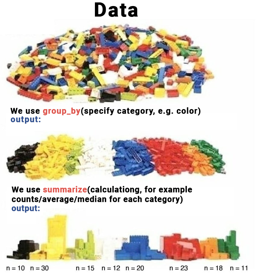
Review
First, load the tidyverse library
Then, load the V-Dem data
load(url("https://github.com/vdeminstitute/vdemdata/raw/6bee8e170578fe8ccdc1414ae239c5e870996bc0/data/vdem.RData"))You are interested in corruption in various geographical regions. Select year (year), region (e_regionpol_7C) and corruption (v2x_corr) variables from the vdem dataset.
corruption_data = ... %>%
  ...(year, ..., v2x_corr)
As we are working with the V-Dem data, let’s rename variables so it’s more straightforward.
corruption_data = corruption_data ...
  ...(region = e_regionpol_7C,
      corruption = ...)
Using group_by() and summarize() calculate the average corruption for all regions in the dataset.
corruption_data ...
  (...) %>%
  ...(average = ...(..., na.rm = T))
Lastly, let’s see the distributions of corruption across regions. Draw a boxplot below with region variable on the X axis, and corruption variable on the Y axis.
ggplot(data = corruption_data) +
  ...(aes(x = ..., y = ...))
Something is wrong, right? We haven’t checked the classes of the variables, and apparently the region variable has to be changed. Let’s check it’s class first.
...(corruption_data$...)What class should it be? Let’s recode it directly on the plot.
...(...) +
  geom_boxplot(aes(x = ...(region), y = ...))
Finally, remove the data we worked with from the environment.
rm(vdem, corruption_data)Agenda
Summarizing Data
Presenting Data with Tables
Exploring Data
Today we are working with the World Values Survey data. You can find the codebook here.
Load the data. Explore the dimensions. This is a smaller version of the dataset, the full one is available on the WVS website.
wvs = read.csv("data/wvs.csv")

ncol(wvs)
nrow(wvs)
[1] 4
[1] 97220Explore the names of the variables.
colnames(wvs)[1] "B_COUNTRY_ALPHA" "Q108" "Q191" "Q194" For your convenience, here is the variables’ description from the codebook:
B_COUNTRY_ALPHA- country nameQ108- Government´s vs individual´s responsibility (10 - people should take more responsibility to provide for themselves, 1 - the government should take more responsibility to ensure that everyone is provided for)Q191- Justifiable: Violence against other people (10 - justifiable, 1 - not justifiable)Q194- Justifiable: Political violence (10 - justifiable, 1 - not justifiable)
Let’s get the range of data. What does it mean?
range(wvs$Q108)[1] -5 10Let’s double check with summary. Same! Take a look on the codebook.
summary(wvs$Q108) Min. 1st Qu. Median Mean 3rd Qu. Max.
-5.000 2.000 5.000 4.945 7.000 10.000 For the purposes of this exercise, drop all missing or irrelevant answers (which you should be very careful erasing in real task).
wvs = wvs %>%
  filter(Q108 > 0)
And for our convenience, rename the variables.
wvs = wvs %>%
  rename(country = B_COUNTRY_ALPHA,
         responsibility = Q108,
         violence = Q191,
         political_violence = Q194)
Presenting Data in a Table
Now, let’s present the descriptive statistics for the responsibility variable, but for each country. Again, tricky group_by() command! Make sure to include mean(), sd() and median(). Again, here is a great explanation of what is going on.
responsibility_description = wvs %>%
  group_by(country) %>%
  summarize(average = mean(responsibility),
            sd = sd(responsibility),
            median = median(responsibility))

responsibility_description %>%
  head()
# A tibble: 6 × 4
country average sd median
<chr> <dbl> <dbl> <dbl>
1 AND 4.47 2.67 4
2 ARG 5.02 2.69 5
3 ARM 4.18 3.41 4
4 AUS 5.34 2.78 5
5 BGD 4.26 2.91 4
6 BOL 5.74 3.06 6Great! Now, let’s make publishable table to present the variable. However, focus only on Post-Soviet countries. Make sure to go through syntax!
post_soviet = c("ARM", "AZE", "BLR", "EST", "GEO", "KAZ", "KGZ", "LVA", "LTU", "MDA", "RUS", "TJK",  "TKM", "UKR", "UZB")

post_soviet_responsibility = responsibility_description %>%
  filter(country %in% post_soviet)

post_soviet_responsibility
# A tibble: 7 × 4
country average sd median
<chr> <dbl> <dbl> <dbl>
1 ARM 4.18 3.41 4
2 KAZ 4.91 2.81 5
3 KGZ 5.11 3.92 5
4 RUS 4.39 2.72 5
5 TJK 5.36 2.84 5
6 UKR 4.43 2.68 5
7 UZB 6.02 3.22 6To make it publishable and visually appealing, load the tinytable library.
library(tinytable)Try it out! Looks great, but we can do more.
post_soviet_responsibility %>%
tt()| country | average | sd | median |
|---|---|---|---|
| ARM | 4.177194 | 3.409121 | 4 |
| KAZ | 4.910256 | 2.808218 | 5 |
| KGZ | 5.107383 | 3.916236 | 5 |
| RUS | 4.393635 | 2.722294 | 5 |
| TJK | 5.359167 | 2.838171 | 5 |
| UKR | 4.429032 | 2.684628 | 5 |
| UZB | 6.022277 | 3.221572 | 6 |
Make sure to format it well. For example, capitalize the names of the columns. Other functions for changing the character case here - you can apply it to observations, too.
colnames(post_soviet_responsibility) = colnames(post_soviet_responsibility) %>%
  str_to_title()
Now, add caption, and round up numbers. Highlight, Central Asian countries: Kazakhstan (KAZ), Kyrgyzstan (KGZ), Tajikistan (TJK) and Uzbekistan (UZB).
post_soviet_responsibility %>%
  tt(caption = "Descriptive Statistics for Post Soviet Region") %>%
  format_tt(digits = 2) %>%
  style_tt(i = c(2, 3, 5, 6), # rows
           j = 1:4,           # columns
           background = "teal",
           color = "white",
bold = TRUE)| Country | Average | Sd | Median |
|---|---|---|---|
| ARM | 4.2 | 3.4 | 4 |
| KAZ | 4.9 | 2.8 | 5 |
| KGZ | 5.1 | 3.9 | 5 |
| RUS | 4.4 | 2.7 | 5 |
| TJK | 5.4 | 2.8 | 5 |
| UKR | 4.4 | 2.7 | 5 |
| UZB | 6 | 3.2 | 6 |
Extra
Here’s another example of what you can do with this. First, prepare the data. Then, draw a tinytable. But this is extra!
post_soviet_description = wvs %>%
  group_by(country) %>%
  summarize(average_r = mean(responsibility),
            sd_r = sd(responsibility),
            average_v = mean(violence),
            sd_v = sd(violence),
            average_pv = mean(political_violence),
            sd_pv = sd(political_violence)) %>%
  filter(country %in% post_soviet)

extra_table = post_soviet_description %>%
  tt() %>%
  group_tt(j = list("Responsibility" = 2:3,
                    "Violence" = 4:5,
                    "Political Violence" = 6:7)) %>%
  { colnames(.) = c("Country", "Average", "SD", "Average", "SD", "Average", "SD"); . } %>%
  format_tt(digits = 2) %>%        # round up to 2 digits
  style_tt(j = 2:7, align = "c")   # center columns

extra_table| Responsibility | Violence | Political Violence | ||||
|---|---|---|---|---|---|---|
| Country | Average | SD | Average | SD | Average | SD |
| ARM | 4.2 | 3.4 | 1.3 | 1.1 | 1.2 | 0.98 |
| KAZ | 4.9 | 2.8 | 1.9 | 2.1 | 1.8 | 2.04 |
| KGZ | 5.1 | 3.9 | 1.5 | 1.8 | 1.4 | 1.69 |
| RUS | 4.4 | 2.7 | 2 | 2 | 2.2 | 2.28 |
| TJK | 5.4 | 2.8 | 2.2 | 1.2 | 2.2 | 1.24 |
| UKR | 4.4 | 2.7 | 2 | 1.8 | 1.9 | 2.01 |
| UZB | 6 | 3.2 | 1.9 | 2.3 | 1.7 | 2.11 |
You even can add plots into the table! You can explore it here.
# Calculate Average for each variable
variables_description = wvs %>%
  group_by(country) %>%
  summarize(responsibility = mean(responsibility),
            violence = mean(violence),
            political_violence = mean(political_violence))

# Create a list of these Averages
# (tinytable syntax requires a list for plots, not the dataframe)
plot_data = list(variables_description$responsibility,
                 variables_description$violence,
                 variables_description$political_violence)

# Create a placeholder table
dat = data.frame(Variables = c("Responsibility",
                               "Violence",
                               "Political violence"),
                 Histogram = "",
                 Density = "",
                 Average = c(mean(variables_description$responsibility),
                             mean(variables_description$violence),
                             mean(variables_description$political_violence)))

# Draw a table, fill in the plots. If images are not displaying, render the document!
tt(dat) %>%
  plot_tt(j = 2, fun = "histogram", data = plot_data) %>%
  plot_tt(j = 3, fun = "density", data = plot_data, color = "darkgreen") %>%
  style_tt(j = 2:3, align = "c") %>%
format_tt(digits = 2)| Variables | Histogram | Density | Average |
|---|---|---|---|
| Responsibility |  |
 |
5 |
| Violence |  |
 |
1.9 |
| Political violence |  |
 |
1.8 |
Check list
Optional Exercises
Explore violence variable in wvs dataset. What is its range?
Draw a histogram of violence variable using ggplot().
Anything strange? What does negative values stand for? Remove if needed.
Present average and median for violence for each country.
Now, present the data for Latin American countries using tinytable. Here is the vector for your convenience.
latin_america <- c(
  "ARG",  # Argentina
  "BOL",  # Bolivia
  "BRA",  # Brazil
  "CHL",  # Chile
  "COL",  # Colombia
  "CRI",  # Costa Rica
  "CUB",  # Cuba
  "DOM",  # Dominican Republic
  "ECU",  # Ecuador
  "SLV",  # El Salvador
  "GTM",  # Guatemala
  "HND",  # Honduras
  "MEX",  # Mexico
  "NIC",  # Nicaragua
  "PAN",  # Panama
  "PRY",  # Paraguay
  "PER",  # Peru
  "URY",  # Uruguay
  "VEN"   # Venezuela
)Customize the tinytable so the columns look like titles. Highlight top-3 most violent countries with red color.